Plenum is a startup that emerged in 2019 with the bold proposition of producing and marketing 3D-printed dental implants instead of the traditional machined ones. Two years later, the company's e-commerce proved to be underutilized and poorly optimized for mobile devices.
Problems
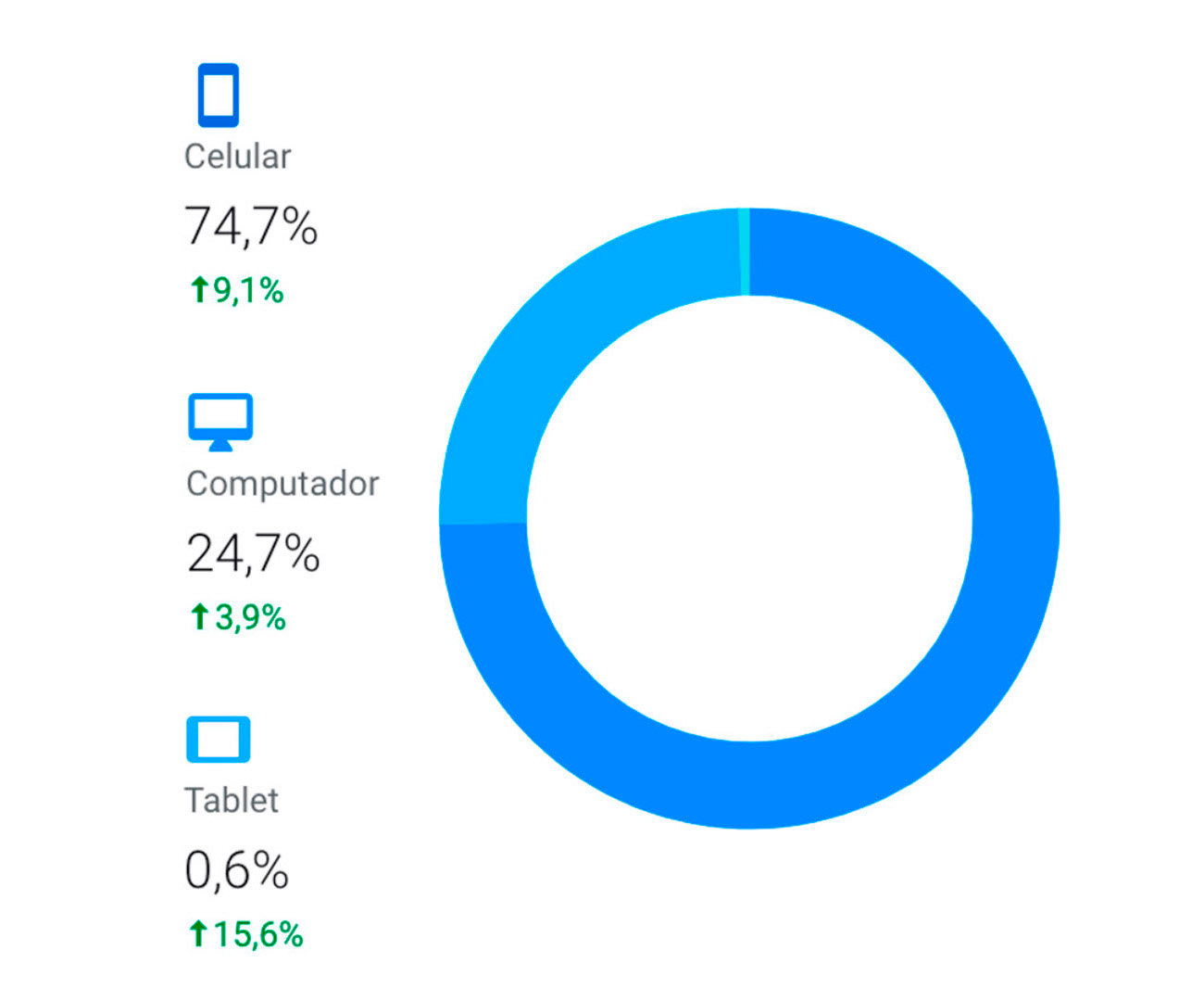
Proporção de sessões do site plenum.bio por dispositivo durante o mês de junho de 2021.
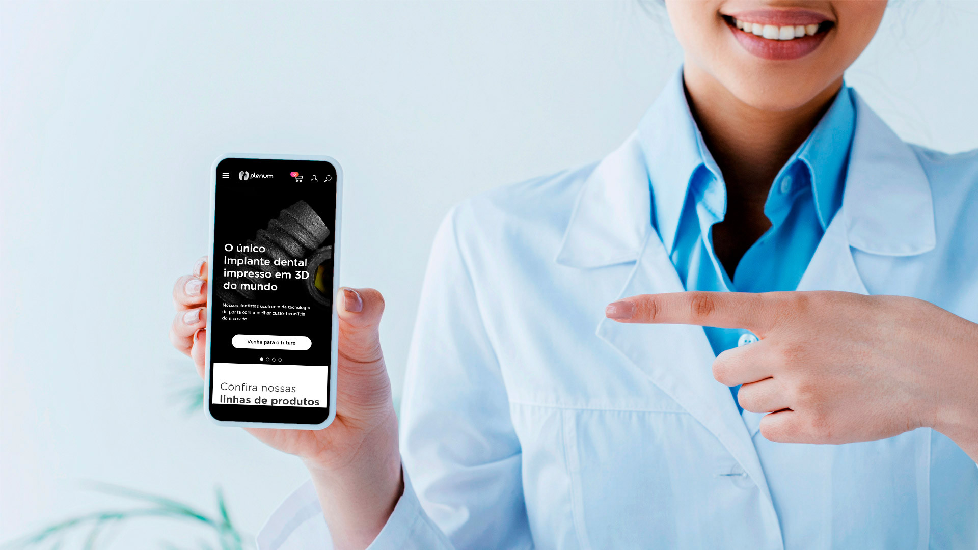
Mobile first
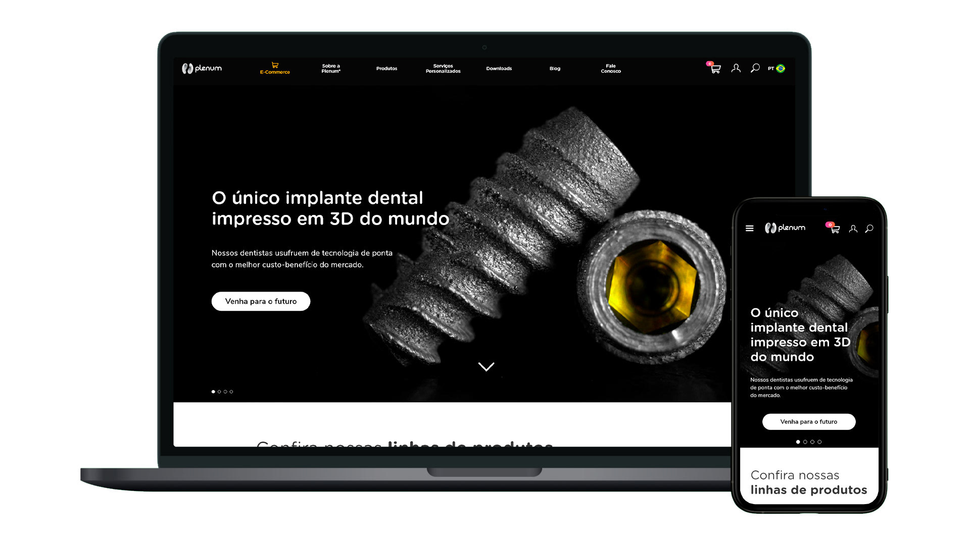
The legacy version of the plenum.bio website was produced in parallel with the company's brand and the first batch of implants and was primarily designed for desktop computers. Over time, the domain was accessed much more frequently from mobile devices. To address this issue, I conducted all the new screen studies, initially focusing on mobile phones and later adapting the content for monitors.
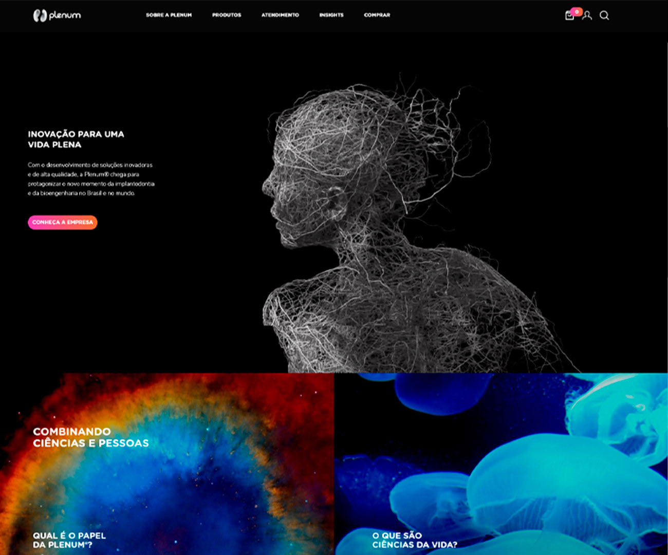
Homepage da versão legado do site plenum.bio.
Loading time
The legacy version was filled with Full HD GIFs and visual effects that got in the way of the smoothness of navigation. The new version was optimized to reduce the media weight, reducing the loading time.
Página de compra da versão legado do site plenum.bio.
Usability
During the heuristic analysis, two negative points stood out:
Recognition rather than recall
All the products were displayed in a sort of cascading menu that overloaded short-term memory. Therefore, a more user-friendly navigation was suggested, in which the user initiates the flow in a large showcase of macrocategories and chooses, screen by screen, where they want to go.
Visibility of system status
Many times, it was difficult for the user to know in which category they were navigating. The new design was oriented to always make it very clear in which category the user is and to give them the autonomy to move forward and go back if they have made any wrong decisions.
Mapa final do novo site após as dinâmicas de card sorting.
Hierarchy and categorization
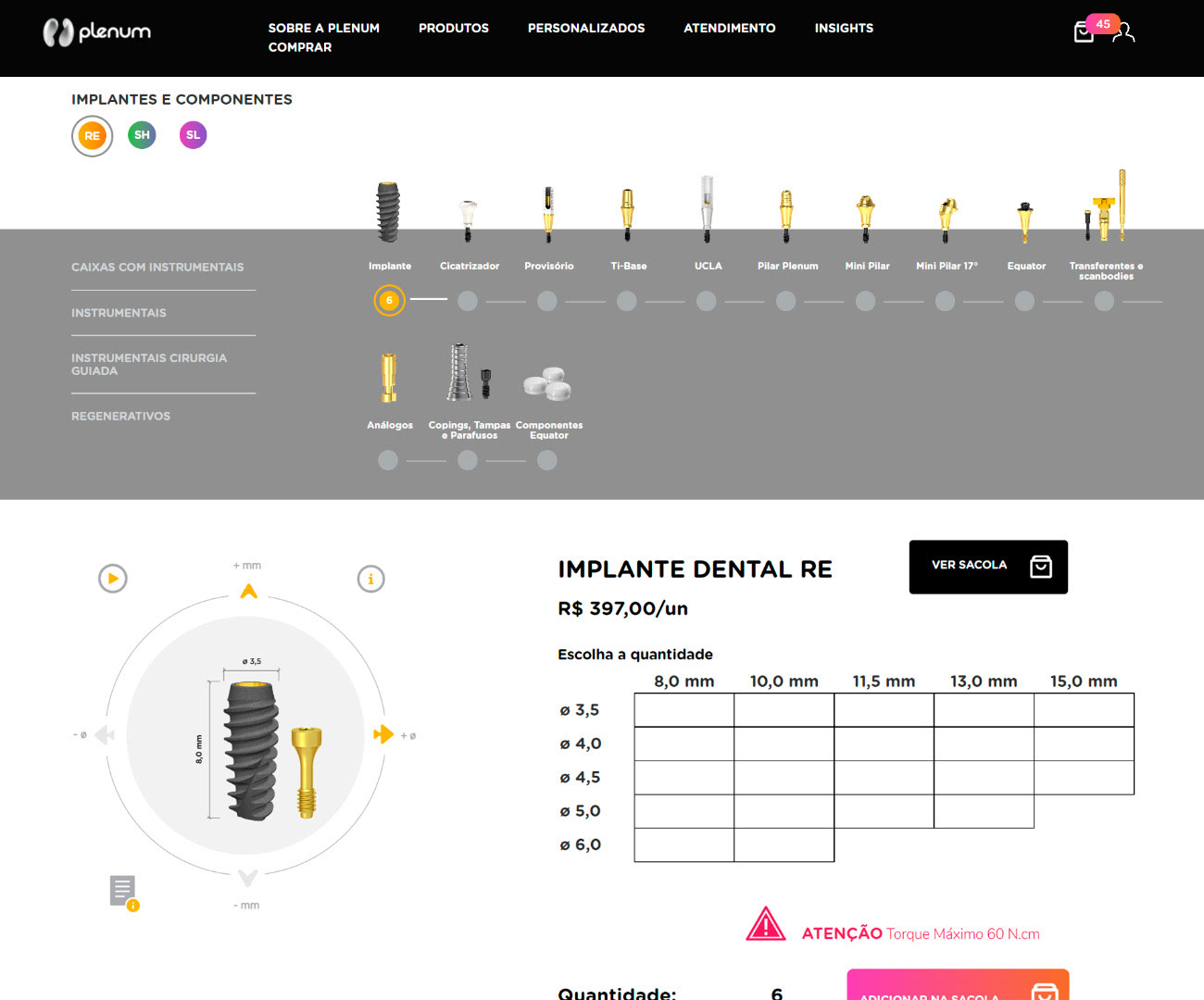
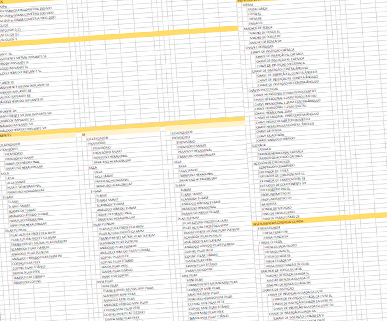
Plenum has a diverse and multidisciplinary product line, and over its existence, several new products have been developed by the R&D team. This significantly impacted the organization of the e-commerce, often requiring improvised and nearly entirely manual solutions. In order to address this, we conducted dynamics inspired by the card sorting model, involving dentists who were already using the site regularly. This allowed us to generate a more relevant and intuitive categorization, from macrocategories down to the dimensions and variations of a single product.
Design
Content
The old version of the plenum.bio website was filled with inspiring texts about biotechnology and innovation, but it said little about Plenum's business model itself or its products. Some users reported that when they first accessed the site, they thought Plenum was an NGO, an innovation hub, or something other than an industry that manufactures and markets products. Therefore, alongside the copywriter, we worked on a new homepage that aims to immediately introduce Plenum's products and its field of operation.
E-commerce
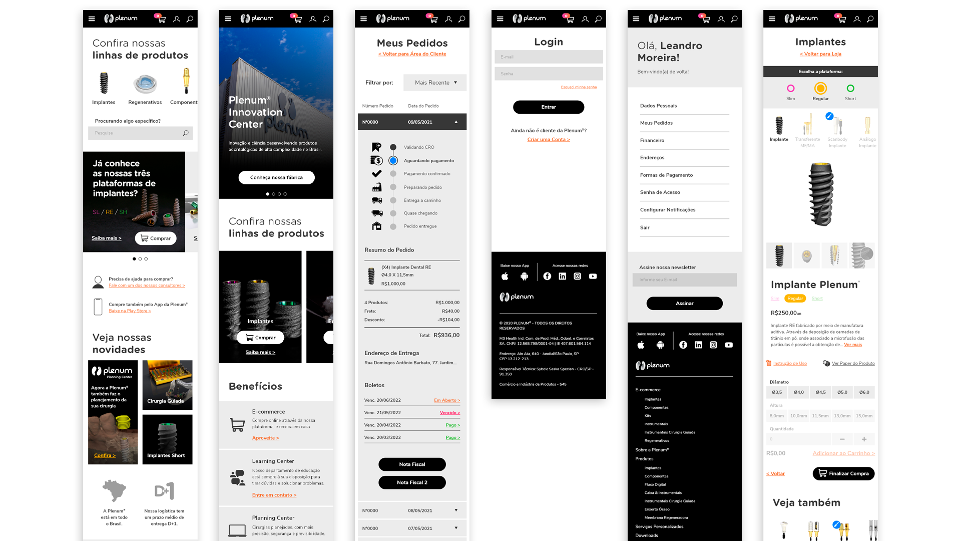
The entire purchasing flow was reorganized, taking into account the challenges and specific needs of dentists who are consumers of dental implants and instruments. The SKUs were organized into broader categories so that users could find the product they wanted more quickly, and new macrocategories were created to facilitate the navigation logic. In addition, entirely new mechanisms were introduced for Plenum, such as coupon systems and shipping configurations.
Over 100 screens prototyped
Throughout several months of work, presentations, and alignments, more than 100 screens were designed, concerning both mobile and desktop versions.
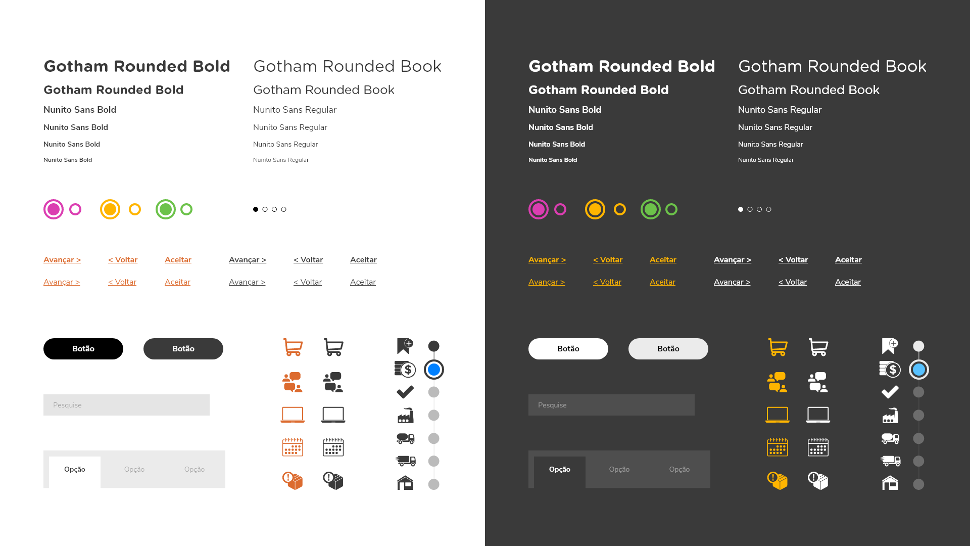
Components
Thank you!